After a long wait, the very first Android 12 developer preview has now arrived which means some neat new tricks and features.
To save you some time and effort, Today we will show you some of the best new user-facing features.
Table of Contents
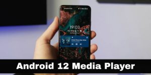
1.New Media Player UI And Enhancements In Android 12

- New look media player UI is easily one of the top new features in this android 12 developer preview.
- It gives far greater prominence to the controls and the associated album art player has changed on both the lock screen.
- When using the quick settings on the notification panel with a larger overall size and easier to manage controls.
- When tapping the playback locator there is also a new pop-up to quickly connect to or pair with a new Bluetooth device.
- Therefore, streamlining the process to get a pair of earbuds or speaker connected to your smartphone.
- The animations and accent color remain the same as the previous version.
- You can also now prevent apps from appearing in the notification shades part of the media resumption controls.
- If you switch apps a ton and only want selected players to be active or resumed.
- After a while then this might be a neat option to keep things organized.
- So long as you’re happy to delve into your settings menu.
2. Settings App Redesign
- Naturally, the settings app has had a few revamps over the years but it looks like there may be some more tweaks.
- Set to arrive over this entire android 12 previews period.
- A new rounded search bar can be found at the top of the main settings page with a far larger profile picture.
- That now lives outside of this shorter search field when diving into each individual section or subsection.
- There are early hints of the upcoming in-depth theming system each subsection now has a blue hue background.
- That we hope will eventually follow your main device theme coloring later developer preview minor.
- But the admittedly notable new feature that you might notice right away the new.
3.Pill-Shaped Activation Toggles
- A minor but noticeable feature is the new Pill-shaped activation toggles.
- Four options within that settings menu are far clearer if an option has been toggled.
- There are some vibes of macOS with each individual switch.
- It is likely evidence of some more changes set to arrive as part of the new settings UI as more updates arrive in the coming months.
4.Tweaked App Shortcut Menu In Android 12
- Another very minor change of the developer preview is the slightly elongated app shortcut menus.
- This means when tapping and holding an app icon on your home screen.
- You might notice that the pop-up is ever so slightly larger than in previous builds.
- likely a quality of life tweak as it is marginally easier to re-arrange or actually activate the shortcuts one-handed.
5.Share WiFi Passcodes With Nearby Share
- In recent versions of android, google has put an emphasis on improving the ability to share your saved passcodes for wireless networks.
- In android 12 not only are you able to share via QR code?
- You can also utilize the neat nearby share feature to share any saved wi-passcodes or passwords with any nearby devices.
- Google has simply added a nearby share toggle to the wi-fi password screen.
- meaning that if you dig into network-specific settings and tap the share button.
- You’ll see a dedicated button for the nearby share.
- On tapping will allow users to quickly share these and passwords of a network to other android users in the vicinity with relative ease.
6.Enhanced Screenshot Markup Tool In Android 12
- Another neat enhancement to an already solid core portion of android in the developer preview 1is that of some added tools.
- The first change to the screenshotting experience sees users no longer able to tap and to remove the bottom left corner notification.
- Instead, users can clear by swiping right to left.
- You can also add text for the first time with seven colors.
- You choose from and a simple pinch-in-and-out motion for changing the font size.
- In a similar manner to that of Snapchat.
- You can also add emoji as stickers which again can be resized by adding a fun layer to the standard screenshot tool.
7.Notification Shade Redesign
- It wouldn’t be an android developer preview if google didn’t make some more notification shade tweaks.
- Yet again this time the notification shade is far more transparent.
- There are some notable changes in how notifications look and feel.
- Google has increased the size of apps within the notification shade with larger fonts and profile images.
- Your quick settings toggles which we must admit can feel cramped with the time date and status bar icons present.
- There’s also a new neat little clock icon that quickly launches the snooze menu for notifications themselves.
To get more related content related to Entertainment, Technology, Windows Fixes, Do-Follow Tremblzer. On Google News.